
Visual Identity Systems for Consumer Brands
Most founders equate branding with a logo reveal. But for consumer brands, a logo is just the entry point — not the ecosystem.
A true visual identity system is the backbone of recognition. It ensures that every ad, package, and Instagram post feels unmistakably yours, even if the logo isn’t visible.
From Boat’s high-energy palettes to Paper Boat’s nostalgia-infused curves, India’s best consumer brands have mastered one thing: consistency that tells a story.
This is what we’ll unpack — how colors, typography, packaging, and digital design combine to create a brand that lives in people’s minds and hearts.
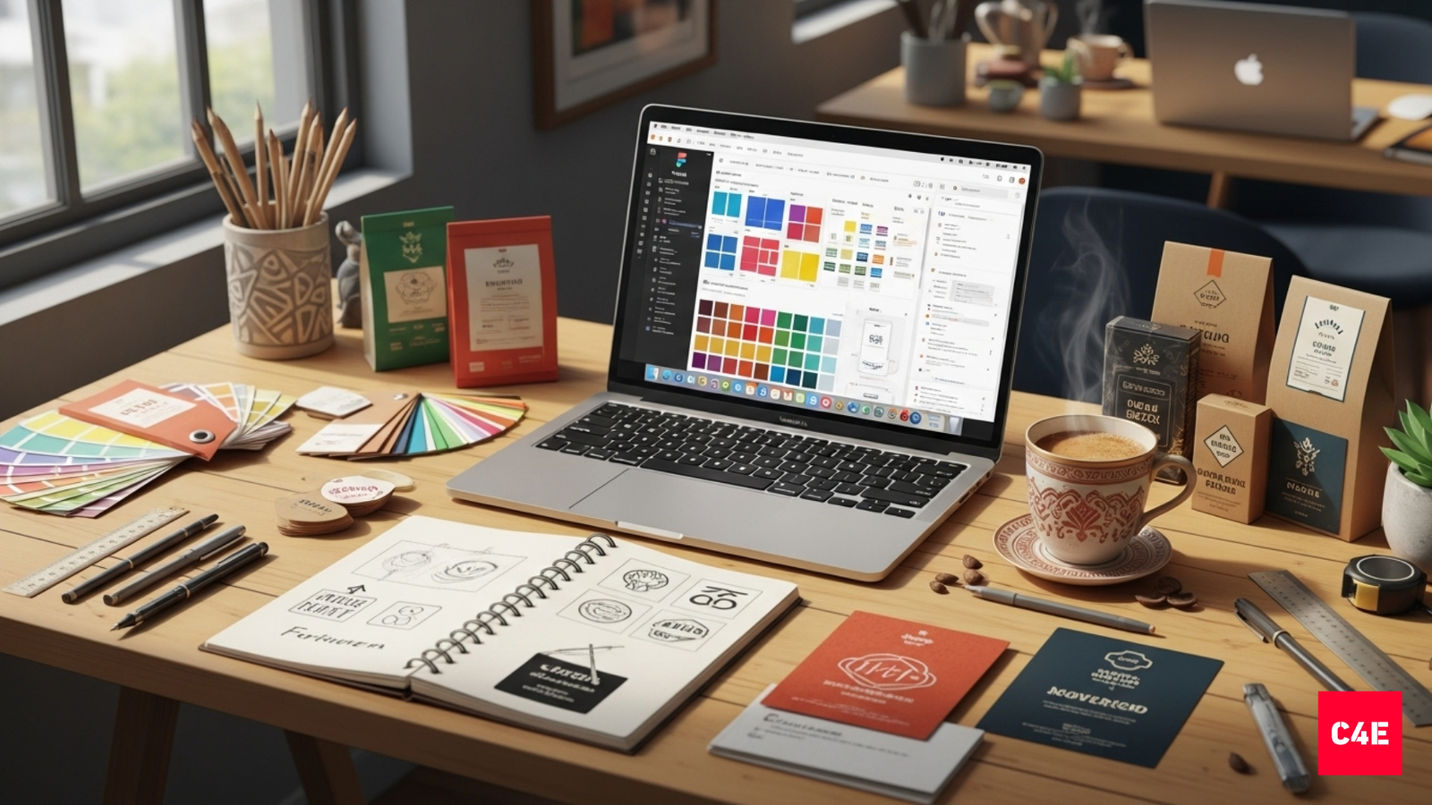
1. What Is a Visual Identity System?
A visual identity system is a structured set of design rules that define how your brand looks across every medium.
| Element | Purpose | Example |
|---|---|---|
| Logo | Primary symbol of recognition | Amul’s timeless wordmark |
| Color Palette | Emotional and visual recall | Boat’s red-black energy palette |
| Typography | Brand personality in letters | Zomato’s bold, friendly sans-serif |
| Imagery & Graphics | Mood and storytelling | Paper Boat’s hand-drawn nostalgia |
| Layout System | Consistency across print, digital, and packaging | Minimalists’ clean grid and white space |
Together, these create visual harmony — what designers call “brand coherence.”
When done well, users can recognize your brand even without seeing your logo. Think of Cadbury purple or Fevicol’s quirky illustration style — you just know.
2. Why Systems Matter More Than Aesthetics
In the early days, a founder’s instinct may shape the brand. But as the company scales — adds new SKUs, enters new markets, hires new teams — instinct turns chaotic.
Without a visual identity system, your brand begins to fracture:
- Different designers use inconsistent colors.
- Packaging redesigns feel off-brand.
- Ads and social content look unrelated.
A system solves that. It’s not about control — it’s about clarity.
Because consistency builds trust, and trust converts faster than design awards.
3. The Psychology of Color in Consumer Brands
Color is the quickest way to trigger memory.
Each hue carries an emotion, and smart brands use it intentionally.
| Color | Emotion / Perception | Example |
|---|---|---|
| Red | Energy, appetite, urgency | Zomato, Boat |
| Blue | Trust, calm, reliability | Paytm, Tata |
| Green | Health, nature, freshness | Paper Boat, Slurrp Farm |
| Yellow/Orange | Optimism, warmth | Bisleri Pop, Happilo |
| Purple | Premium, creativity | Cadbury, Plum |
A good brand palette includes:
- 1 Primary color (core brand recall)
- 2–3 Secondary colors (for flexibility)
- 1 Neutral base (for typography/backgrounds)
Indian consumer brands also face a cultural layer: certain colors have deep symbolic meaning. Red evokes emotion; green signals purity; gold evokes prosperity. Great design translates this psychology into modern aesthetics.
4. Typography: The Unsung Hero of Brand Personality
Typography often decides whether your brand feels trustworthy or trendy.
For consumer brands:
- Sans-serif fonts (like Gilroy, Inter, Montserrat) communicate modernity and ease.
- Serif fonts (like Playfair Display or Georgia) feel elegant or heritage-driven.
- Custom fonts (like Zomato Sans) create memorability.
Good typography hierarchy defines:
- Headings (H1–H3): for emotion and attention.
- Body: for legibility and calm reading.
- Accent: for tone and flavor (like handwritten notes or scripts).
Typography isn’t decoration — it’s your voice in visual form.
Example:
Plum Goodness uses clean sans-serif typography balanced with cursive accents in packaging, making the brand feel friendly yet premium. That’s the power of font psychology in retail.
5. Imagery and Iconography: Crafting Visual Language
Imagery tells the story your logo can’t.
For consumer brands:
- Lifestyle imagery humanizes the product.
- Illustrations or icons add personality.
- Texture and lighting convey tactile emotion (matte = sophistication, glossy = energy).
Example:
Paper Boat uses soft pastel illustrations evoking childhood memories — it’s not just design; it’s sentiment in pixels and packaging.
Meanwhile, Boat relies on bold contrast, urban photography, and product close-ups that scream attitude.
Two opposite approaches, both deeply consistent with their brand personalities.
6. Packaging: Where Brand Meets Hand
For consumer brands, packaging is often the first physical touchpoint.
And it must translate the digital brand system perfectly.
A packaging system includes:
- Core brand elements: logo, colors, patterns.
- Functional hierarchy: product name > benefit > variant > ingredients.
- Material consistency: matte vs glossy, recyclable vs premium finish.
- Scalability: design system that adapts across SKUs and product lines.
Example:
Minimalist uses clean white boxes with soft green accents and grid alignment — the same visual grammar as its website.
Slurrp Farm uses bright colors, hand-drawn typography, and kid-friendly visuals — perfectly aligned with its brand mission.
Packaging isn’t just protection. It’s perception in 3D.
7. Creating Design Consistency Across Touchpoints
Your customer doesn’t see departments. They see one brand.
Which means your visual identity must feel unified across:
- Website and app UI
- Social media posts and ads
- Packaging and print
- Retail or event experiences
The simplest way to ensure this is a brand style guide — a digital rulebook that explains:
- How to use the logo (and how not to)
- Color usage (primary, accent, and background rules)
- Font hierarchy and spacing
- Image tone and framing examples
- Mockups of applications (Instagram posts, signage, packaging)
A consistent design system amplifies recall.
Inconsistency, even subtle, erodes trust.
8. Building a Visual Identity System: Framework
Here’s a practical step-by-step approach:
| Stage | Goal | Action Step |
|---|---|---|
| Audit | Understand existing visuals | Collect all current brand assets |
| Strategy | Define brand essence | Identify 3 adjectives (e.g., bold, youthful, grounded) |
| System Design | Create modular rules | Define logo usage, color, type, and layout logic |
| Testing | Validate across media | Apply to mockups and packaging |
| Documentation | Build a style guide | Host on Notion, Figma, or Frontify |
| Implementation | Roll out across teams | Train internal designers and agencies |
This framework turns brand identity from art to system — scalable, teachable, and replicable.
9. Common Mistakes in Visual Identity
| Mistake | Impact | Fix |
|---|---|---|
| Random color usage | Dilutes recognition | Create locked color tokens |
| Overly trendy typography | Ages quickly | Choose timeless, legible fonts |
| No spacing or grid logic | Inconsistent layouts | Define design grids early |
| Disconnected packaging and digital | Brand feels fragmented | Sync visual direction from one master system |
| Inconsistent photography filters | Reduces recall | Define image tone and lighting preset |
Visual consistency isn’t about being rigid — it’s about being recognizable.
10. Indian Case Studies: Visual Identity Systems That Work
| Brand | Visual Direction | Identity Insight |
|---|---|---|
| Boat | Bold red-black palette, strong typography | Energy and rebellion encoded visually |
| Paper Boat | Soft pastels, childlike illustrations | Nostalgia-driven emotional design |
| Plum | Minimal layouts, pastel accents | Clean beauty aesthetic with modern calm |
| Tata Soulfull | Earthy tones, modern serif fonts | Tradition meets new-age nutrition |
| The Whole Truth | Transparent packaging, blunt typography | Radical honesty turned into visual design |
Each brand treats its visual system as a living organism, evolving with new formats but never losing its soul.
11. Evolving the System Without Losing Identity
The best visual systems adapt with time — not against it.
How to evolve without confusion:
- Update accents, not foundations. (e.g., new color gradients, same logo core.)
- Refresh photography and illustration styles every 18–24 months.
- Use motion identity (animated logos, kinetic typography) to modernize.
- Introduce AI tools for adaptive design (dynamic color grading, contextual layouts).
Example: Cadbury’s subtle logo evolution in 2020 retained its purple core but added smoother typography — familiarity, modernized.
The key: change what’s dated, not what’s distinct.
12. The Future: AI-Driven Brand Systems
AI now plays an active role in visual identity creation and maintenance:
- Runway / Sora: Generates brand films consistent with your color palette.
- Midjourney / Leonardo.ai: Produces consistent campaign imagery at scale.
- Frontify / Brandpad: Auto-checks visual guideline compliance.
- ChatGPT plugins: Generate brand tone copy matched to your design language.
For growing consumer brands, this means faster rollout, more experimentation, and tighter consistency across content formats — from packaging to product photos.
Final Reflection: Design as Memory Architecture
A strong visual identity system is like urban planning for your brand — every building (ad, post, package) has to belong to the same city.
When done right, customers don’t just recognize your product; they feel like they’re home when they see it.
That’s what separates brands people buy from brands people believe in.
Build a Visual System That Scales
We help consumer brands build cohesive design systems — from brand identity to packaging, social, and retail.
If you’re scaling across categories, we’ll make sure your brand looks and feels unmistakably you, everywhere.
Frequently asked questions
What makes a brand stand out?
A clear point of view made visible: an owned colour, distinct typography and a consistent voice, repeated everywhere until people recognise you before they read the name.
Do we need a rebrand or just a refresh?
Most companies need a refresh (evolved design, sharper messaging), not a full rebrand. Start with an audit before deciding.
How long does brand work take?
A focused brand strategy and identity project usually runs 8 to 12 weeks, depending on scope and decision speed.
Building or sharpening a brand?
C4E treats brand as a strategic business tool: positioning, identity and design that solve real problems.