
MOD or Motilal Oswal? Our Two Cents on the Revamped Identity
Before going to bed last night, I saw Motilal Oswal’s new brand make rounds on some WhatsApp groups.
How do I and we as a brand design agency feel about this?
So, without any context, the first thing I clicked on was:
I thought the chatter was about a new payments / SaaS startup called Mo. Without immediately dissecting, I made a mental note – good bright yellow.
Turns out, it was Motilal Oswal.
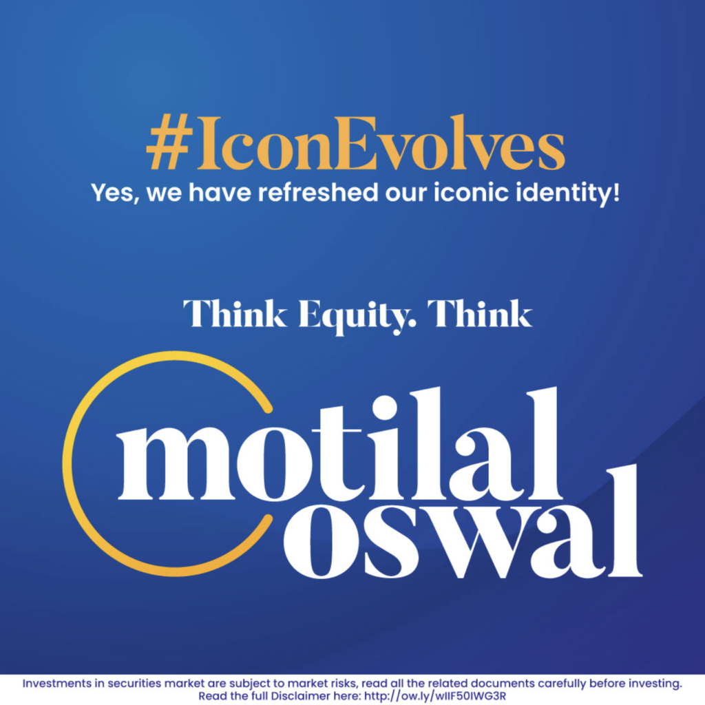
An official announcement of the revamped identity.
“We are thrilled to unveil the refreshed brand identity of Motilal Oswal Financial Services Limited—a bold step forward while staying true to our rich legacy. The iconic ‘arc of essence’ in orange celebrates decades of discovering hidden pearls in the ocean of stocks, while our modernized logo and deep blue colour radiate trust, professionalism, and innovation.”
Like most things, the Internet is divided on this too. We’re on the side that believes this doesn’t work. Here’s why:
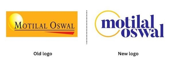
The Font
The lowercase wordmark diminishes the perception of legacy and authority that they’ve built over the last few decades. More traditional fonts, or even uppercase letters convey qualities that are important in the financial sector – stability and trustworthiness.
The Colours
Is it purple or is it blue? The brand seems to have moved on from yellow – a dominant colour – to colours that are owned by various brands already. No distinction there. Think Cadbury. FedEx. Twitch. Or go all the way back to Yahoo.
So while relevancy is okay, building brand recall or association will be tougher now. In their case, rebuilding it from the yellow.
On a lighter note, a friend told me, “I have three words for you: Mad Over Donuts”. He’s 21. Said that he won’t be putting his money here.
The thing is, their heart is in the right place. They know they need to appeal to a younger audience now. And do this amidst “sexy” startups selling to these groups.
If I were to attempt this, I would think of:
Step 0: Customer research.
Both direct and indirect. Since Motilal Oswal’s entry into the market, the world has changed. The target customer, accumulated wealth, aspirations, the economy, everything.
So, step 0 would be to do customer research. Look at what people are buying, who they are buying it from, how those fintech brands are communicating, and what promises they are making.
Think of brands like Zerodha, Groww, or Dezerv. They don’t have time and legacy on their side. Some are not even full-stack financial service companies. But, they are talking about money and wealth to the same customer.
In short, we would start with the user.
The best example? FedEx. Their internal and stakeholder research helped them discover what no logic could’ve. FedEx isn’t FedEx because it’s cool, but because a shop floor worker called it so. Among other things.
Apart from that, some things that come to mind:
1/ Building on top of the fundamentals
Instead of scrapping them altogether. The uppercase type, warm colour palette (yellow and red), and the geometry.
2/ Make the logo unit less busy
We’d start by removing the underline and then replace the font. They’re not modern for sure. I would also redesign the arc of essence to create one motif (right now, there are two distinct elements).
The point is, all of this would emerge from the research. In the last two days, unofficial conversations helped me discover things that can’t be discovered theoretically.
An uncle who has spent the last 15 years in the financial sector pointed out some of these insights. Something as specific as not being able to marry lowercase fonts with money as a wide sector.
The 21-year-old branding student who practically lives on the Internet talked about MOD.
This exercise is what helps point out (and avoid) obvious misses.
When we re-imagined the Global Fintech Fest (logo, visual identity, communication), we talked to over 40 folks from the industry. Both decision makers and decision influencers. And the conversations were not about what they wanted the platform to look like, but everything from their perceptions to aspirations. And for each insight, we created an asset. A logo. Of course, just a few got shortlisted internally to be presented. But it all started at level 0.
That’s all.
Oh, thanks to Parth from Uphill and others from the C4E Village for helping make this a detailed note.
Chandni