The Color of Trust in Branding and Marketing: Why Indian Brands Need to Rethink Their Palette
The other day, while working on branding and marketing for a health-tech brand, a young designer proudly presented a bright orange logo as part of their brand identity and brand strategy.
“Orange represents energy and creativity,” she explained, citing color psychology studies from American universities. Most folks on the call nodded appreciatively – except for the oldest person present, the client’s father, who’s also a silent partner in the business.
“But orange is the color of renunciation,” he said quietly. “Will our Hindu customers trust their money with a brand that reminds them of sadhus?”
That moment crystallized something I’ve observed over two decades in Indian branding and marketing: we’re still looking West for color wisdom in a culture that wrote its own color rules millennia ago.
Looking Inwards
Consider this: in India, a bride wears red, a widow traditionally wears white, and our gods are depicted in every hue imaginable – from the blue-skinned Krishna to the elephant-headed Ganesha in his festive red. Colors here aren’t just visual choices; they’re encoded with centuries of cultural memory.

Yet, as a brand building agency working across India, we keep encountering the same disconnect. International brand consultants prescribe blues for trust (yes, like every tech company ever), red for energy (ignoring its sacred significance in Indian marriages), and yellow for optimism (forgetting its association with haldi’s everyday humility). And we’ve seen some brands have paid dearly for this cultural colorblindness.

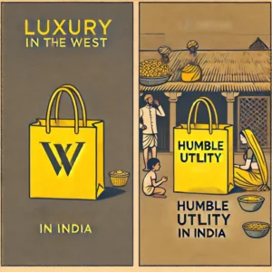
I remember a premium fashion brand that launched its flagship store in South Mumbai with yellow shopping bags, only to have customers request plain ones instead – they felt uncomfortable carrying what looked like grocery bags. The brand’s creative agency had missed a crucial cultural cue: in many Indian households, yellow is the color of humble everyday items, not luxury. Plus it looks like a day-to-day bag that your local sabzi wala will carry!
Some get it right too!
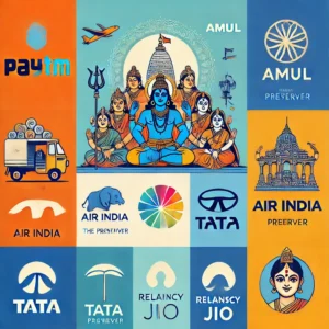
But look at the brands that get it right. Paytm’s blue isn’t just about following the fintech crowd – it subtly evokes Vishnu, the preserver, signaling security in a way that resonates deeply with Indian users. Amul’s orange isn’t religious saffron but a warmer, more secular tone that speaks of everyday joy. Even Air India’s red, often dismissed as dated, carries deep cultural resonance – it’s the color of sindoor, of auspicious beginnings. Of couse, all these are my interpretations!

Application while working on branding and marketing
To be hoenst, this isn’t about abandoning global color theory; it’s about enriching it with cultural intelligence. At C4E, we’ve seen how this deeper understanding transforms brand performance. One of our clients, a wellness brand, switched from international-standard green to a specific shade of copper derived from traditional Ayurvedic vessels. Their brand recognition soared, particularly among elders and older customers who instantly connected it with authentic healing traditions.
The most successful Indian brands understand this cultural code. Tata’s blue speaks both international corporate and spiritual truth. Reliance Jio’s blue manages to evoke both digital innovation and divine infinity. These aren’t coincidences – they’re masterclasses in cultural color fluency. I am in awe of their branding agencies!
Yet walk through any startup hub in Bengaluru or Gurugram, and you’ll see a sea of western-inspired color schemes. It’s as if we’re trying to build Indian brands while speaking a foreign color language. Tech startups all blur into the same blue, fintechs play safe with corporate navys, and D2C brands copy-paste international color trends without considering how they translate locally. Even the names and logos have started to look the same.

Why does this matter?
This matters because color isn’t just about aesthetics – it’s about trust. In a market where purchasing decisions still often involve multiple family members across generations, your brand’s colors need to resonate across age groups and cultural contexts. The same shade that appeals to a 25-year-old in Mumbai might alienate their grandmother in Madurai.
So here’s my challenge to my team specifically and Indian brands and the creative agencies serving them: stop copying international color guides blindly.
I encourage my team to start with cultural context. I tell them to ask themselves: What does this color mean in a Hindu household? In a Muslim home? To other big religions? To an elderly customer? To a young professional? How does it translate across regional and religious boundaries?
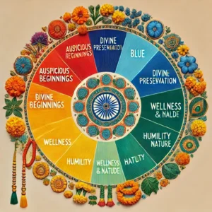
Remember, we’re building brands for a country where colors carry the weight of centuries. Your brand’s palette shouldn’t just catch the eye – it should speak to the soul. So, the next time you’re choosing colors for your brand, don’t just think about what looks good. Think about what feels true. In a market as complex as India, that difference could mean everything.
After all, in the land of Holi, colors are never just colors.
PS: All images from Chat GPT’s Dall-E.

