
How to Create a Visual Brand Identity from Scratch
Yes, your logo doesn’t define your brand, but it might just be the reason someone gives you five seconds or none at all.
Today, visuals are your first handshake with a customer. The gut feeling. The thing people remember when your name slips their mind.
And most brands still get it wrong. They default to whatever’s trending. They skip strategy. They treat brand identity like a mood board, not a message.
This guide is the fix you need to create a visual brand identity.
We’ll walk you through the process of creating a visual brand identity from scratch. Step by step, no design degree needed. From picking the right colors to choosing a font that actually makes sense for your brand voice, you’ll learn how to build a look that’s beautiful but, more importantly, is built to last.
Done right, you will be able to create a visual brand identity that reinforces it at every touchpoint. Because you don’t need to be flashy, you just need to be clear, consistent, and unmistakably you.
Let’s go!
Step 1: Define Your Brand Foundation
Wondering how to build a brand identity that’s more than just color and type? It starts right here, with your foundation.
Before you touch color palettes or open Canva, pause. Your brand identity starts long before the design.
A good visual brand is built on clarity.
You need to know:
- What you stand for (mission and values)
- Who you’re talking to (audience)
- How you want to be remembered (personality)
That trio is what makes your design choices make sense.
Ask yourself:
- If your brand were a person, how would it speak?
- What emotions do you want your visuals to trigger?
- Who’s seeing this? And what do they care about?
If your answers are vague, your identity will be, too.
This is also where most brands skip ahead. They jump to aesthetics without defining what those aesthetics are supposed to say. And that’s how you end up with a minimal logo for a loud, playful brand or pastel colors selling a hard-nosed SaaS tool.
Design is communication.
You can’t communicate what you haven’t figured out.
A strong brand identity design process forces clarity early, which is exactly what gives your visuals long-term traction.
Step 2: Design Your Core Visual Elements
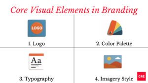
Once your foundation is clear, it’s time to get visual.
Your goal is to design assets that feel right and not just good.
Let’s break it down.
1. Logo
Your logo may not be your brand, but it is your shortcut.
It’s the one asset that shows up everywhere: your website, your packaging, your emails, your social media. If it’s messy, forgettable, or off-tone, that’s the impression you leave behind.
But what makes a good logo?
- Simple enough to be recognized at a glance
- Scalable for everything from favicons to billboards
- Relevant to what you do and how you want to be seen
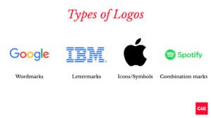
Types of logos:
- Wordmarks (Google)
- Lettermarks (IBM)
- Icons/Symbols (Apple)
- Combination marks (Spotify)
Tools to try: Canva (for beginners), Adobe Illustrator (if you want control), Looka (for quick AI-generated options)
2. Color Palette
Color builds memory. It’s why we associate red with Coca-Cola and blue with trust-heavy brands like PayPal.
But picking colors also requires alignment.
Start with:
- 1–2 primary colors (your brand’s main vibe)
- 2–3 secondary/accent colors (for contrast and flexibility)
- Neutral background tones (white, off-white, gray)
Brands that use consistent color schemes see their recognition increase by up to 80%.
Tools to try: Coolors, Adobe Color, My Brand Kit (Canva)
3. Typography
Fonts have personality. And no, using five of them doesn’t mean you have range.
Stick to two:
- A primary font (for headlines)
- A secondary font (for body text)
Make sure they’re legible across sizes and screens. And don’t just pick “what looks cool.” A luxury brand shouldn’t be using Comic Sans. A fintech startup probably shouldn’t be using a cursive script.
Pro tip: Pair a serif with a sans-serif for contrast that still feels clean.
4. Imagery Style
Photos, illustrations, icons: this is where many brands lose the plot.
Your imagery should be:
- Consistent in tone (light and airy vs. moody and dramatic)
- Cohesive in subject (people vs. products vs. abstract)
- Styled for your platform (e.g., mobile-first visuals, vertical videos)
In a survey, original graphics like infographics and illustrations outperformed stock photos. In fact, such pieces are 30x more likely to be read than plain text.
Pro tip: If you’re using stock photos, curate them. Don’t grab the first smiling woman with a salad. Pick images that reflect your tone and your audience.
Step 3: Create a Brand Style Guide
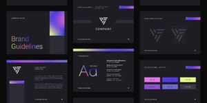
Designing your brand assets is just the beginning. Keeping them consistent is what turns them into an identity.
That’s where the visual branding guide comes in.
It’s your brand’s operating manual for anyone who touches your brand: marketers, freelancers, developers, partners.
What to include:
- Logo usage: Clear space, sizing rules, dos and don’ts
- Color palette: Hex codes, RGB/CMYK breakdowns
- Typography: Font names, sizes, where each is used
- Imagery: Visual tone, approved styles, icon treatments
- Voice/tone (optional): If your visual identity is part of a bigger rebrand
Why it matters:
- Prevents your brand from getting diluted as you grow
- Speeds up onboarding for anyone creating branded content
- Ensures consistency across every touchpoint, from your Instagram to your investor deck
50% of marketers still create visual content themselves using tools like Canva and Adobe. A solid style guide means they don’t have to guess. They simply follow the system.
If you want to be recognized, be consistent. If you want to be consistent, write it down.
Step 4: Tools to Bring It All Together
You’ve got the vision. Now, you need the right tools to execute without losing hours or your sanity.
Here’s the shortlist of what works and when to use what:
For Beginners: Canva
No learning curve. No clunky menus. Just drag, drop, and done.
Best for:
- Social media graphics
- Pitch decks
- Quick brand kits
Why it works: Canva makes brand consistency easy. You can preload your logo, colors, and fonts into its Brand Kit, so your entire team is designing with the same rules even if no one has design training.
Over 40% of marketers use online tools like Canva for visual content creation. For small teams, that’s often enough.
For Pros: Adobe Creative Cloud
If Canva’s the friendly sidekick, Adobe is the full-blown design lab.
Best for:
- Detailed logo design (Illustrator)
- High-res marketing materials (InDesign)
- Visual effects and editing (Photoshop)
Why it works: Total control. No design ceiling. But expect a steeper learning curve and more time investment.
51.43% of marketers still design their own visuals. For the ones who want high-production quality, Adobe remains the answer.
Bonus Picks (Depending on Your Needs)
- Coolors / Adobe Color: To build color palettes that work everywhere
- Looka: For AI-powered brand kits (if you’re moving fast)
- Figma: For collaborative design, especially across product and marketing teams
- Visme: For branded reports, infographics, and presentations
Visual Identity, Done the Right Way
You don’t need a big budget to build a brand that looks and feels authentic. You just need to stop designing in the dark.
A visual brand identity is less about making things “pretty” and more about creating a system that speaks your brand’s truth instantly and everywhere.
So here’s your cheat sheet:
- Understand who you are and who you’re for
- Design visuals that match that identity and not what’s trending
- Build a style guide to keep things consistent
- Use the right tools to execute faster, better, sharper
The brands that win today won’t be the flashiest but the most consistent, the most clear, and the hardest to confuse. So, if you’re starting from scratch, it’s all good. You get to build it right.
Need help bringing your brand identity to life?
At C4E, we know how to distill your brand’s essence into visuals that stay in your audience’s mind. Whether you’re building from scratch or sharpening what’s already there, we’ve got you.
Let’s create something unmistakably yours.
Frequently asked questions
What makes a brand stand out?
A clear point of view made visible: an owned colour, distinct typography and a consistent voice, repeated everywhere until people recognise you before they read the name.
Do we need a rebrand or just a refresh?
Most companies need a refresh (evolved design, sharper messaging), not a full rebrand. Start with an audit before deciding.
How long does brand work take?
A focused brand strategy and identity project usually runs 8 to 12 weeks, depending on scope and decision speed.
Building or sharpening a brand?
C4E treats brand as a strategic business tool: positioning, identity and design that solve real problems.