
How to Make Your Brand Stand Out in a Sea of Sameness
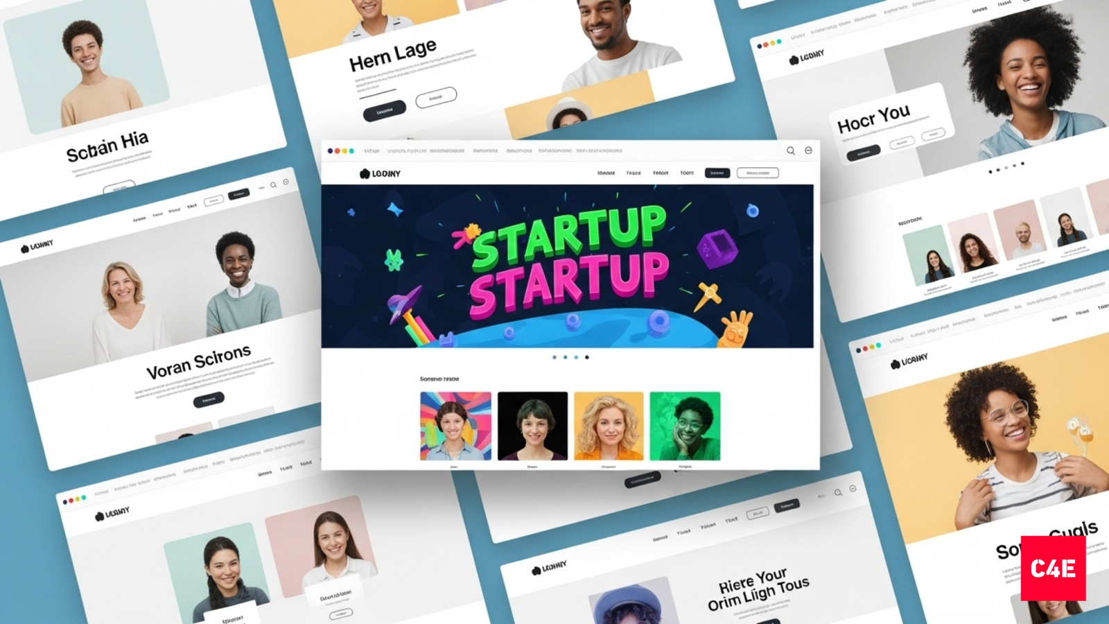
Scroll your LinkedIn feed or Instagram Explore page and every brand looks familiar. Soft sans-serif type. Rounded icons. Pastel gradients. Clean, safe, and impossible to tell apart. SaaS startups look like skincare brands, skincare brands look like fintech apps, and the fintech apps look like each other. If users cannot tell you apart, they will not remember you. Here is how digital-first brands break out of the sameness.
Why everything started looking the same
Design got democratised. Shopify themes, Figma kits and AI tools let any early brand look polished fast, and that speed came at the cost of originality. Three forces drive the clone effect:
- Templates. Pre-built Shopify and SaaS kits reuse the same layouts.
- VC aesthetics. Founders copy whatever the funded brands look like.
- Dribbble culture. Designers chase trends for likes, not for distinction.
The result: a fintech dashboard, a skincare page and a crypto landing page could all belong to the same company.
Minimalism became a uniform
Minimalism began as a rejection of clutter. Now every startup claims clean design, and when everyone does, it stops meaning anything. Minimalism without intent is just absence. Aim for intentional reduction, not aesthetic reduction. Decide what the simplicity should express (calm, luxury, trust), then add the one detail that makes it yours. Calm and Headspace are both minimal. One leans on playful illustration, the other on immersive gradient. Both clean, neither interchangeable.
What real differentiation looks like
Strong digital brands use design as strategy, not decoration. Each of these feels owned, not borrowed:
- Notion. Monochrome minimalism plus a community-led aesthetic.
- CRED. Dark, luxury palette with cinematic motion.
- Sleepy Owl. Hand-drawn packaging and a coffee-brown lifestyle tone.
- The Whole Truth. Bold black, honest typography, zero filters. Instantly memorable.
- Fi Money. A purple gradient and conversational voice in a category obsessed with trust badges.
Brand identity is memory architecture
Attention is short and scroll speed is high, so your identity has to work in milliseconds, before anyone reads the tagline. Build for four kinds of memory:
- Shape memory: a distinct icon or logo geometry.
- Colour memory: own a hue or a gradient style.
- Motion memory: transitions and animations unique to your product.
- Tone memory: the voice your visuals and copy share.
You see Zomato’s red or Dream11’s icon and your brain fills in the name. That is repeatable cues doing their job.
A five-step framework to break the template trap
- Audit the category. Screenshot 20 competitors. Note the recurring colours, fonts and layouts.
- Define the brand mood. Pick three adjectives that fix your personality (bold, optimistic, grounded).
- Create visual tension. Choose one rule to break against the category: colour, shape, motion or texture.
- Build a design system. Lock colours, type and spacing as tokens so it scales consistently.
- Reinforce everywhere. Repeat the key cues across ads, UI and packaging until they stick.
Differentiation is not about being loud. It is about being intentional.
Own a colour, own a typeface, add a layer
Colour is the fastest recognition trigger: commit to one and use it relentlessly. Typography now does the work a logo used to, so a distinct typeface carries more identity than another rounded wordmark. And the next brand layers are motion and sound: a signature transition or audio cue is territory most competitors have not claimed yet.
AI is accelerating sameness, so use it differently
AI tools make average design nearly free, which means average no longer differentiates anything. Use AI to move faster on the production, then spend the time you save on the parts AI cannot fake: a point of view, a story, and craft. The brands that win will feel human in a feed full of presets.
Frequently asked questions
Why do so many brands look the same now?
Cheap, fast tooling. Shopify themes, Figma kits and AI design tools let early brands look polished in a day, but they reuse the same layouts, fonts and palettes. Add founders copying whatever looks funded, and you get aesthetic convergence: everyone lands on the same look.
How do I make my brand stand out without a big budget?
Differentiation is a decision, not a spend. Audit 20 competitors, pick one rule to break (a colour, a typeface, a motion, a tone), and repeat that cue everywhere. Owning one distinctive element beats redesigning everything.
Does minimalism hurt differentiation?
Only when it is empty. Minimalism became a uniform because everyone claims clean design. The fix is intentional reduction: decide what emotion the simplicity should carry, then add the one detail (texture, type, micro-interaction) that makes it yours. Calm and Headspace are both minimal and feel nothing alike.
What does it mean to build brand recognition that works in milliseconds?
People scroll fast and judge before they read. Strong brands build memory through repeatable cues: a shape, an owned colour, a signature motion, a consistent tone. You recognise Zomato’s red or Dream11’s icon before the name. That is the goal.
Building or sharpening a brand?
C4E treats brand as a strategic business tool: positioning, identity and design that solve real problems.