
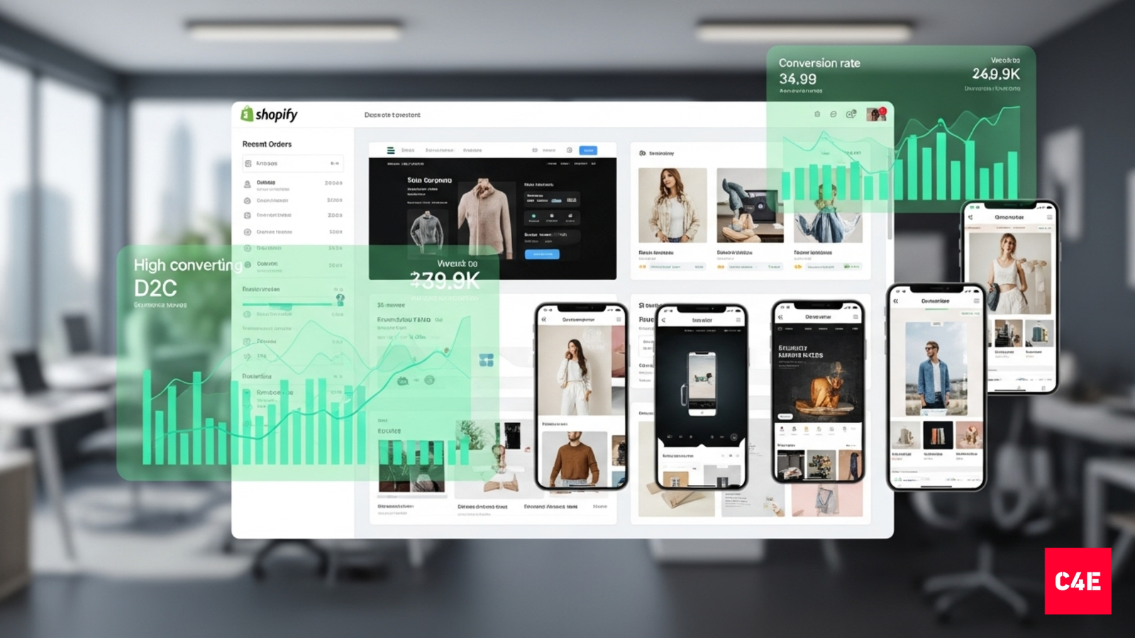
Shopify Design Principles for Converting D2C Stores
Every D2C founder eventually hits the same realization — good design doesn’t automatically mean good sales. You can have stunning photography, the perfect Shopify theme, and still see carts abandoned halfway.
Because a design that looks good isn’t the same as a design that works. The difference lies in understanding how users actually shop online — where their eyes move, what builds trust, and what triggers hesitation. Great Shopify stores aren’t creative portfolios; they’re silent salespeople.
1. Pretty Doesn’t Sell. Clarity Does.
Most D2C founders spend months perfecting packaging, colors, and photos — then wonder why the Shopify store isn’t converting.
The truth is, people don’t buy because your store looks “nice.”
They buy because it feels clear, trustworthy, and easy.
Great Shopify design isn’t about art direction. It’s about conversion architecture — using layout, motion, and micro-interactions to remove hesitation and increase AOV (Average Order Value).
2. Above-the-Fold Is a First Impression, Not a Hero Banner
The top of your homepage (above the fold) determines bounce rate in seconds.
Founders often waste this space with abstract headlines like “A Revolution in Skincare” — beautiful, but empty.
Instead, follow the 3C Rule:
- Clarity: Say what you sell. (“Clean, science-backed skincare for Indian skin.”)
- Credibility: Add social proof or press logos immediately.
- Conversion Path: Include a visible CTA (“Shop Now” or “Take the Quiz”).
Example:
The Whole Truth and Minimalist nail this — bold headlines, transparent copy, direct CTAs.
No confusion. No fluff. Just confidence.
3. Navigation: Design for 3-Click Decisions
Your navigation is the silent salesman of your store.
If users can’t find what they want in 3 clicks, they’ll leave.
Best practices:
- Keep top navigation simple: 5–6 primary categories max.
- Use mega menus for subcategories (especially for large SKUs).
- Add search with autocomplete — most converting shoppers already know what they want.
- Keep the cart and login always visible in the top-right.
Example:
Boat uses clean, fixed navigation and prominent icons. It’s not fancy — it’s frictionless.
4. Mobile-First, Always
In India, 80–90% of D2C purchases now happen on mobile.
That means if your site isn’t designed for mobile (not just resized), you’re losing money.
Mobile-first principles:
- Sticky CTAs: Add “Add to Cart” or “Buy Now” buttons that scroll with the user.
- One-hand navigation: Keep primary actions in thumb reach (bottom center or right).
- Reduce visual clutter: 2–3 products per row, clear spacing, legible text.
- Compress visuals smartly: Optimize load speed under 2.5 seconds.
Example:
Sugar Cosmetics’ mobile site is optimized for fast thumb decisions — bright CTAs, crisp text, and intuitive flow.
5. Product Pages: Sell Through Story, Not Specs
Your product page is where conversion happens — or dies.
And too often, it reads like a warehouse inventory sheet.
High-converting Shopify stores treat product pages like mini landing pages:
- Lead with benefit-driven headlines, not feature lists.
- Use lifestyle imagery to show context of use.
- Add short-form video loops for tactile feel (especially for skincare, apparel, or fitness).
- Show social proof right before the Add to Cart button.
Example:
Sleepy Owl uses storytelling-driven product pages — emotional copy, clean visuals, and clear CTAs that make you crave coffee.
6. Visual Hierarchy: The Science of Focus
The human eye scans in F-patterns or Z-patterns online.
Your Shopify layout should direct that flow intentionally.
| Goal | Placement Rule | Example |
|---|---|---|
| Key CTA | Upper right or center fold | “Add to Cart” on The Whole Truth |
| Price & Variant | Near product name (no scroll) | Boat’s earphone SKUs |
| Secondary CTAs | Below description | “Add Another” / “Subscribe & Save” |
| Trust Badges | Close to checkout button | “Secure Payment” / “Free Returns” |
Hierarchy isn’t about minimalism — it’s about guiding attention.
7. Copy and Microcopy: Write for Decisions
Design gets users to pause. Copy gets them to click.
Most Shopify stores lose conversions because their microcopy sounds robotic.
Replace:
- “Submit” → “Get My Starter Kit”
- “Learn More” → “See How It Works”
- “Add to Cart” → “Let’s Try This”
These small changes make your CTAs conversational, not transactional.
And for Indian D2C audiences, add tone warmth.
People buy from people — not pixels.
8. Trust Design: Making Credibility Visible
Trust isn’t built in the checkout. It’s built before the checkout.
Key design trust signals:
- Visible UGC: Real customer photos, not stock images.
- Press badges: “As seen in Vogue / GQ / YourStory.”
- Certifications: (Vegan, cruelty-free, Made in India, etc.)
- Transparent delivery info: “Ships in 24 hours,” “Easy 7-day return.”
- Customer reviews: Use visual meters and “verified purchase” tags.
Example:
Plum integrates trust badges and delivery timelines visually — so users never need to guess.
9. Checkout Design: Fewer Fields, More Conversions
Shopify’s default checkout is strong — but small design tweaks can boost completion rates dramatically.
Best practices:
- Enable Shop Pay, GPay, Apple Pay: Reduce input friction.
- Remove unnecessary fields: Only collect what you need.
- Add progress indicators: (“Step 1 of 3”) reduces anxiety.
- Show security seals: Builds confidence right before the card entry.
- Use address autocomplete: Mobile users love it.
Stats show every extra form field drops conversion by up to 11%.
Example:
Lenskart nails checkout UX — 3 steps, clear progress bar, no confusion.
10. Boosting AOV With Smart Design Nudges
Design can subtly nudge higher AOV if done right.
| Design Feature | Behavior Trigger | Example |
|---|---|---|
| “Add this for ₹199 more to get Free Shipping” | Loss aversion | The Man Company |
| “Complete the Set” bundle suggestion | Commitment bias | Minimalist |
| “People also bought…” | Social proof | Boat |
| “Subscribe & Save” option near checkout | Reward bias | Sleepy Owl |
| “Limited Edition” badge | Scarcity | Plum |
These cues don’t interrupt the buying journey — they enhance it.
11. Speed, Accessibility, and SEO: The Hidden UX Factors
Even the most beautiful store fails if it’s slow or inaccessible.
Google’s Core Web Vitals now directly affect conversions and ranking.
Checklist:
- Load speed: Under 2.5s (use Shopify’s built-in optimizer + compressed images).
- Alt text: Describe all product images for accessibility + SEO.
- Font contrast: Minimum 4.5:1 for readability.
- Avoid motion overload: Limit animation to critical moments.
- Use semantic structure: H1 → H2 → body for crawlability.
Your Shopify site isn’t just a store — it’s a performance engine.
12. Post-Purchase Experience: Where Design Builds Retention
The sale doesn’t end at checkout.
Smart brands design the post-purchase layer to build retention loops.
Ideas:
- Thank You page CTA: “Get 10% off your next order — join our WhatsApp club.”
- Unboxing design: Add QR code linking to product care or founder story.
- Follow-up email visuals: Mirror store branding for continuity.
Example:
The Souled Store integrates branded emails and playful thank-you cards — turning one-time buyers into community members.
13. Data-Driven Design: What to Measure
Every design decision should ladder up to a measurable conversion goal.
| Metric | Design Lever |
|---|---|
| Bounce Rate | Above-the-fold clarity |
| Add-to-Cart Rate | Product page hierarchy |
| Checkout Completion | Field reduction, trust badges |
| AOV | Bundles, upsells, free-shipping thresholds |
| Returning Customer Rate | Post-purchase experience design |
Run A/B tests. Measure scroll depth. Watch session replays (Hotjar, Lucky Orange).
Let data shape your next design sprint — not designer ego.
14. India-Specific UX Insights
Indian D2C shoppers behave differently:
- They rely heavily on Cash on Delivery (COD) — ensure it’s visible early.
- They often browse in low-light or low-data conditions — optimize for dark mode and speed.
- They value trust and familiarity — local imagery and language can boost conversions by up to 20%.
Localized design isn’t about token Indian motifs.
It’s about contextual comfort.
Final Reflection: Good Design Feels Invisible
The best Shopify stores don’t look designed — they feel obvious.
Every scroll, click, and tap feels natural because it mirrors how humans make decisions, not how designers arrange pixels.
When design stops showing off and starts helping, conversion follows.
Build a Shopify Store That Sells While You Sleep
We help D2C brands turn Shopify stores into growth machines — combining behavioral design, data, and storytelling.
From homepages to checkout flows, every pixel is optimized to convert. Reach us at cm@c4e.in